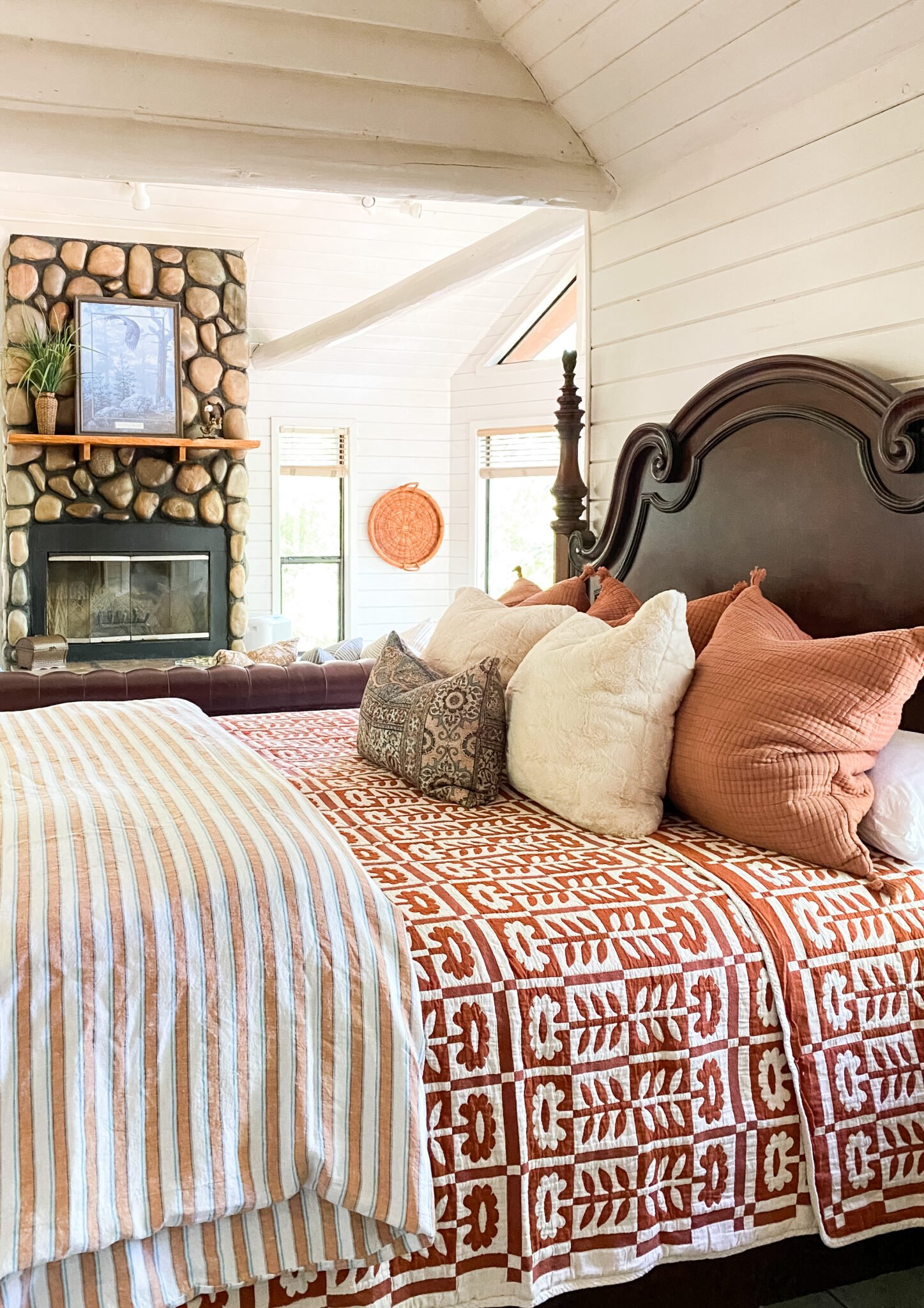
A Bedroom Design—what all goes into the process?
Let’s talk about all the elements that go into a well designed bedroom. We spend so much of each day in our bedrooms. Yet so often we give it the least amount of attention. But shouldn’t the room we rest and recharge in be a room that makes us FEEL comfortable and able to take those deep breaths that our bodies need to restore us?
This summer I’ve spent a fair amount of time upgrading and re-styling a few of the bedrooms in our Oklahoma cottages and our Nashville Airbnb. I’ve also done a few primary bedroom design projects for my E-design clients lately. Needless to say bedding, rugs, accessories, etc has been occupying a large section of my creative energies. So why not design one to feature here on the blog?!
The inspiration
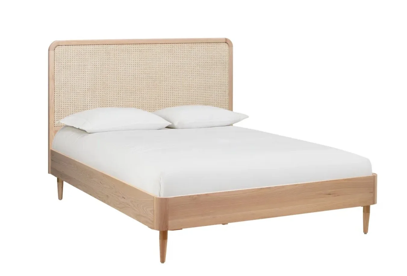
For this bedroom I started with the bed frame.
I love the beautiful detail of the caning on the headboard combined with the minimalistic outline of the frame. The clean lines feel peaceful and calming to me—a vibe that’s important in a room we rest in.
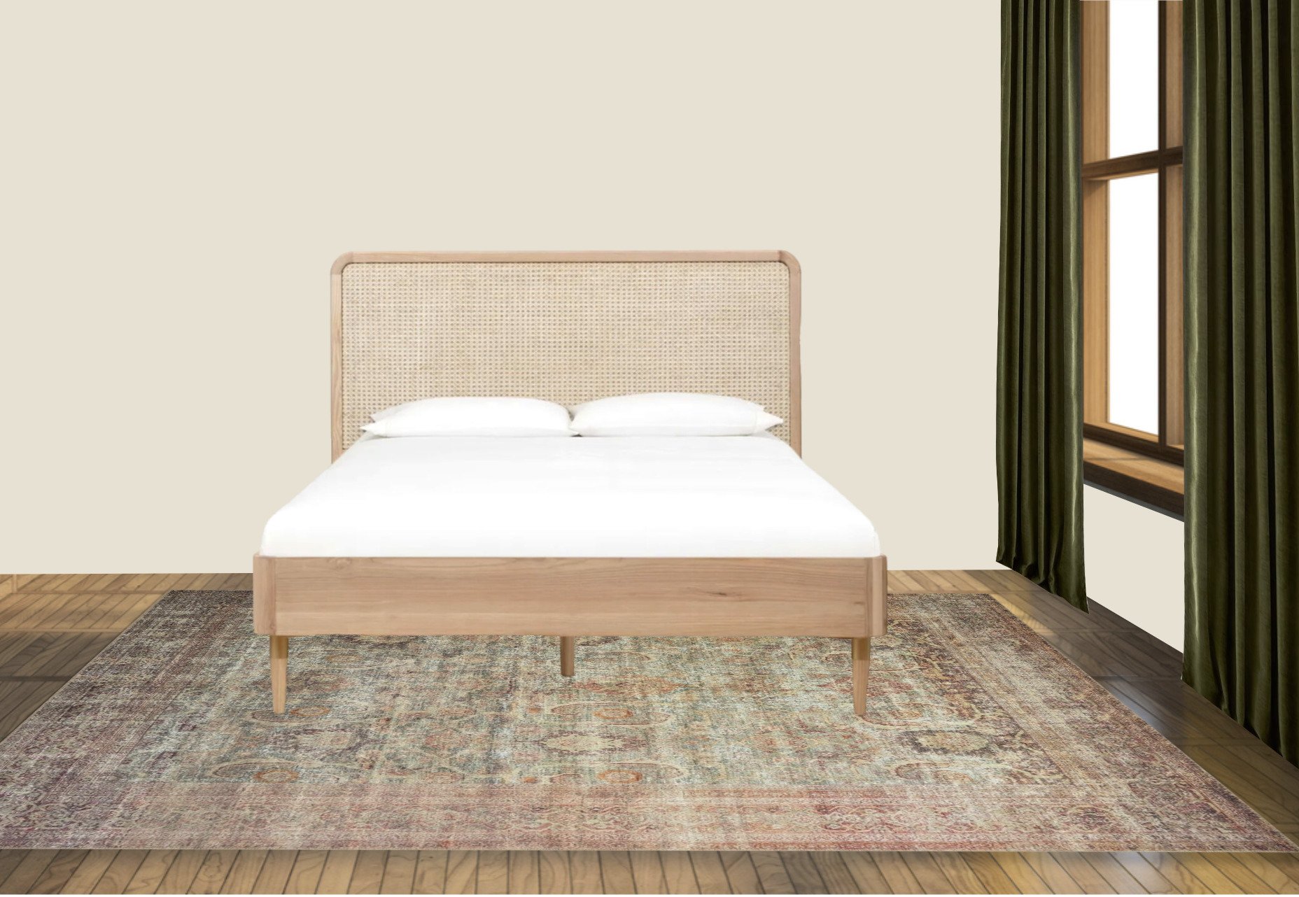
Usually in the design process I would next choose a rug. One, because there’s so much inspiration to be found in the colors and pattern in rugs, and two, because it’s typically easier to build off the colors in a rug than to find one that goes with the colors you already have going on. But in the case of this bedroom design I broke out of my usual design chronology. I found these luscious worn velvet curtains in a deep and opulent green hue. For a while I tried to go in a different direction with the design but I just kept coming back to those drapes!
Next up I set out to find a rug. But let’s stop there for a second and let me chase an important rabbit—I already knew I wanted the room to have a warm vintage vibe. Therefore a creamy color on the walls was a pretty easy choice. I just helped a client pick a light beige for her living room. We had several Samplize swatches I’d narrowed down to chose from and Feather Down, by Benjamin Moore, was the clear winner. I liked it so much I knew I wanted to use it in this bedroom.
So, now back to the search for the perfect rug. I’m really digging the Georgie rug from the Amber Lewis x Loloi collection—I just put the ocean/sand color version in my Nashville Airbnb—and the jade/sunset color-way fit perfectly with the green curtain panels and the cane bed frame. Score!
Next up—the essential case goods
I’m really drawn to rooms that look like they’ve been curated and styled over time. One way to do that is to make sure your furniture isn’t all matchy-matchy. It’s important to aim for balance but mix up the furnishings. I love using furniture in unexpected ways. A stack of baskets can easily become a sofa end table. Change up the hardware and an office cabinet can become a dining room sideboard.
For the bedroom instead of traditional nightstands I chose a wooden chest of drawers on one side of the bed and trunk cabinet for the other side. They’re similar in size and height which checks our balance box. And yet they both give the room a bit of soul and each tell a bit of a story on their own.
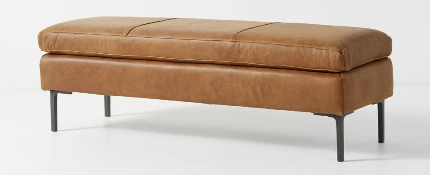
Next I added a leather bench to the foot of the bed, which gives you a place to sit when putting on those running shoes or sandals for work. I love how the leather gives an extra layer of color and texture. It plays so nicely with the patina of the wooden window trim and the pine chest. And the cast iron legs gives a good nod to the black in the trunk cabinet.
And to round out the furniture pieces I chose a vintage-inspired club chair that’s upholstered in a fabric that reminds me of a pair of well worn jeans. I appreciate how adding the blue of the chair adds a bit of cool to the warm palette. I’m a big believer that most rooms need both warm and cool colors to keep them grounded and pleasing to the eye.
Lighting and mirrors
Can we talk for a minute about just how important lighting is! Great lighting has a way of setting the mood in a room without you even realizing it’s affecting you. Next time you go in a restaurant or a store think about the way it makes you feel. Ask yourself if the lighting is playing a part in that feeling. Do you wanna hang around and shop? Or is it more of a get in and get out sort of feeling you have while in the store? The same is true for our homes— lighting has such an affect on our moods. Well-lit rooms have lighting coming from multiple sources. Sources that are on dimmers so they can be adjusted to the needs of the hour!
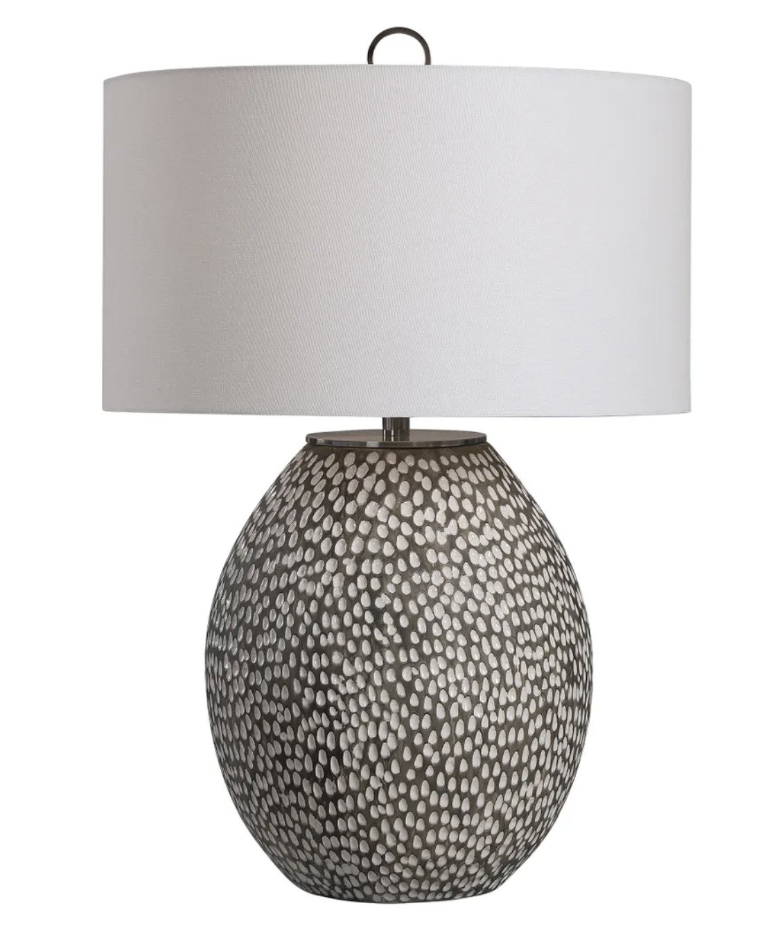
For this bedroom I chose a set of ceramic lamps featuring a lot texture. They’re lamps with a heavy visual punch, appropriately matched, proportion-wise, to the case goods that house them.
Behind each lamp I’ve layered in a large scalloped mirror in an antique brass finish. I love how the curvature features of the mirror softens the contour of the more blunt edges of the bed frame, chest, and leather bench. Plus, adding mirrors is such a fabulous way to add to the lighting and depth of the room. The reflection from the mirrors will bounce around light and shapes and color in the room adding to the layer and shadows that make up a full-design feeling.
Not every bedroom can handle a chandelier, but oh my goodness, I love it when the architecture of the room allows for one! It’s like icing on the cake. For this bedroom, since its being designed exclusively for this blog post, the world is our oyster and we get to have a chandelier! The one I chose has an organic quality to it. The leaves are simple yet give you a feeling of being in nature. And the iron repeats the black hue of the chest pulling at that design thread.
The bedding essentials
Next up are the soft goods! If you’ve been a reader of my blog for long you know I love color. But when it comes to bedding I really like to start with a neutral base. There’s something spa-like about white or ivory sheets and duvets. And then you can layer on color with your quilts, throw, and pillows. Plus a neutral foundation allows for a seasonal change up of the top layers, i.e. velvet quilts in the cooler months and linen throws during the warmer seasons.
So for this bedroom I chose an ivory duvet cover with lots of woven texture and fringe. Then I layered the bed with a color-blocking, heirloom-inspired floral quilt.
Side-note—I recently put this quilt in one of my cabins at River’s Edge Cottages and I love the weight and quality of it!
With all the texture and fringe on the shams and duvet, plus the pattern and color on the quilt I made the stylistic choice to add only one throw pillow with a William Morris nature-inspired motif that pulls the room colors all together. Then I added a chunky knit throw and rust color floral pillow to the arm chair.
Styling and accessories
I styled the room with plants, books, candles, and baskets. Even in a digital world these touches make the room come alive. And in real-world spaces plants and personal touches have the potential of making a room really sing.
When you are thinking through a room design always remember to add elements that have a variety of heights. This helps the eye to move through the room and gives it more of that 3dimensional feel that creates visual interest in a space. In this room I added in a faux tree not only for the greenery but also for that additional height element. (For more thoughts about how to make a faux tree look real check out this post.)
There’s also a large woven basket that’s a good spot to store extra pillows and throws, plus it adds a tactile texture and organic feel to the room.
And last but never least, I added in books, decorative boxes and candles. These small elements are not only visually pleasing but they also have functions that add to that relaxation and rest that a bedroom should provide us with.
And voila—the full design!
So there ya have it! What’s your favorite part of the space? Would you change anything?
If you’ve been kicking around the idea of changing up your bedroom and would like some help, let me know! I’d love to come alongside you and help you create a restful space that reflects your unique tastes and needs.

