Going Bold with Paint in the Bathroom
Last fall when I decided to paint my downstairs bathroom a bold shade of pink I had no idea that the color of the year for several paint companies was going to end up in that same color family.
We often have no idea how much we’re influenced by culture! Or maybe we as a people are similar in so many ways and what our eyes are craving is way more universal than we realize?
For a while now we’ve been moving away from the gray trend. Interior color palettes are warming up. And the prediction is color may well have a heyday in our near future. From an anthropological point of view I find that fascinating. From a personal point of view its thrilling. If you’ve been around my blog long you’ve noticed that I’m a fan of color!
Before we jump into my bathroom project let’s look at these color of the year choices—
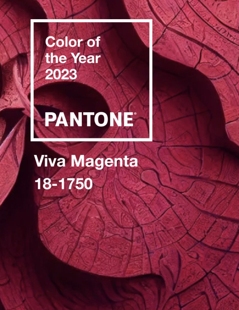
2023 Color of the Year
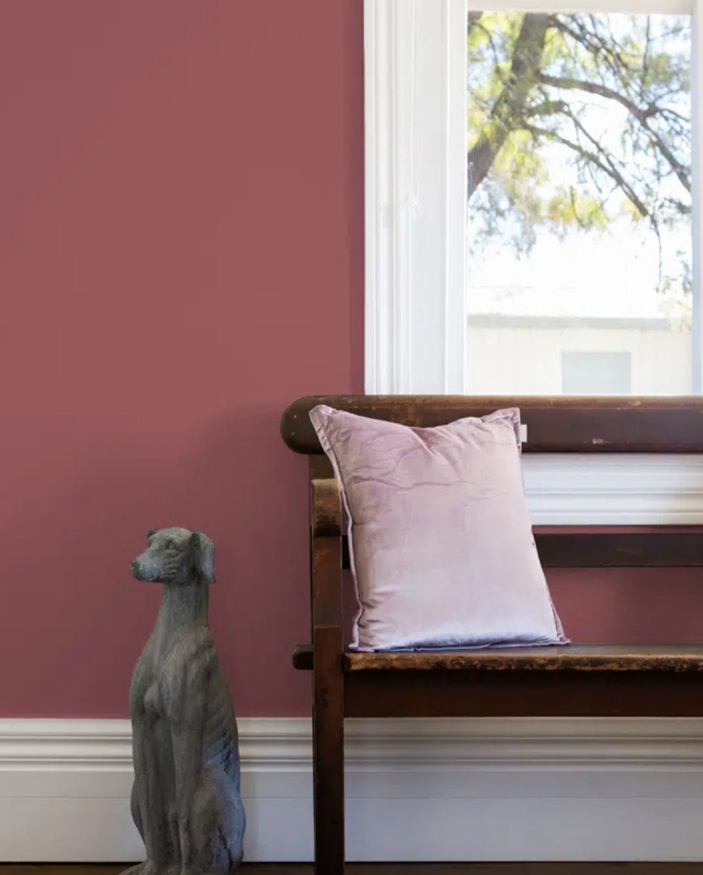
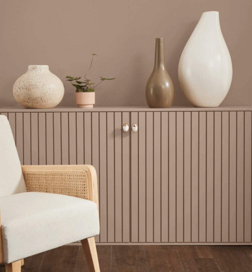
Benjamin Moore, Dunn Edwards, Sherwin Williams and Pantone all have chosen red/pink hues for their 2023 color of the year! Albeit very different interpretations of that side of the color wheel.
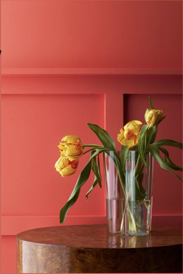
Benjamin Moore describes its Raspberry Blush as “a vivacious shade of coral tinged with pink, enlivening the senses with an electric optimism.”
Sherwin Williams asks us to “embrace a spirit of connection with the world around us with this soulful-yet-subtle hue” of Redend Point.
Pantone says its Viva Magenta “is a new animated red that revels in pure joy, encouraging experimentation and self-expression—a boundary-less shade that is manifesting as a stand-out statement.”
Dunn-Edwards describes its Terra Rosa as “a deep, rosy pink hue with a touch of terra-cotta influence that exudes confidence…”
Gosh, all those descriptions sound so happy and cheerful. Sign me up!
OK, now on to my bathroom project—
A Facelift for my Bathroom
It’s been on my to-do list for a while to give our downstairs bathroom a bit of a tuneup. At some point in the future the old girl needs a renovation—she’s got a serious retro-vibe and all the wrinkles to go with it—but until that happens I wanted to give her an adventurous facelift. Something bold!
I had originally toyed with the idea of wallpapering the space. But the walls are too rough for that. SO, that meant I needed to be courageous with the paint color!
Picking a Paint Color
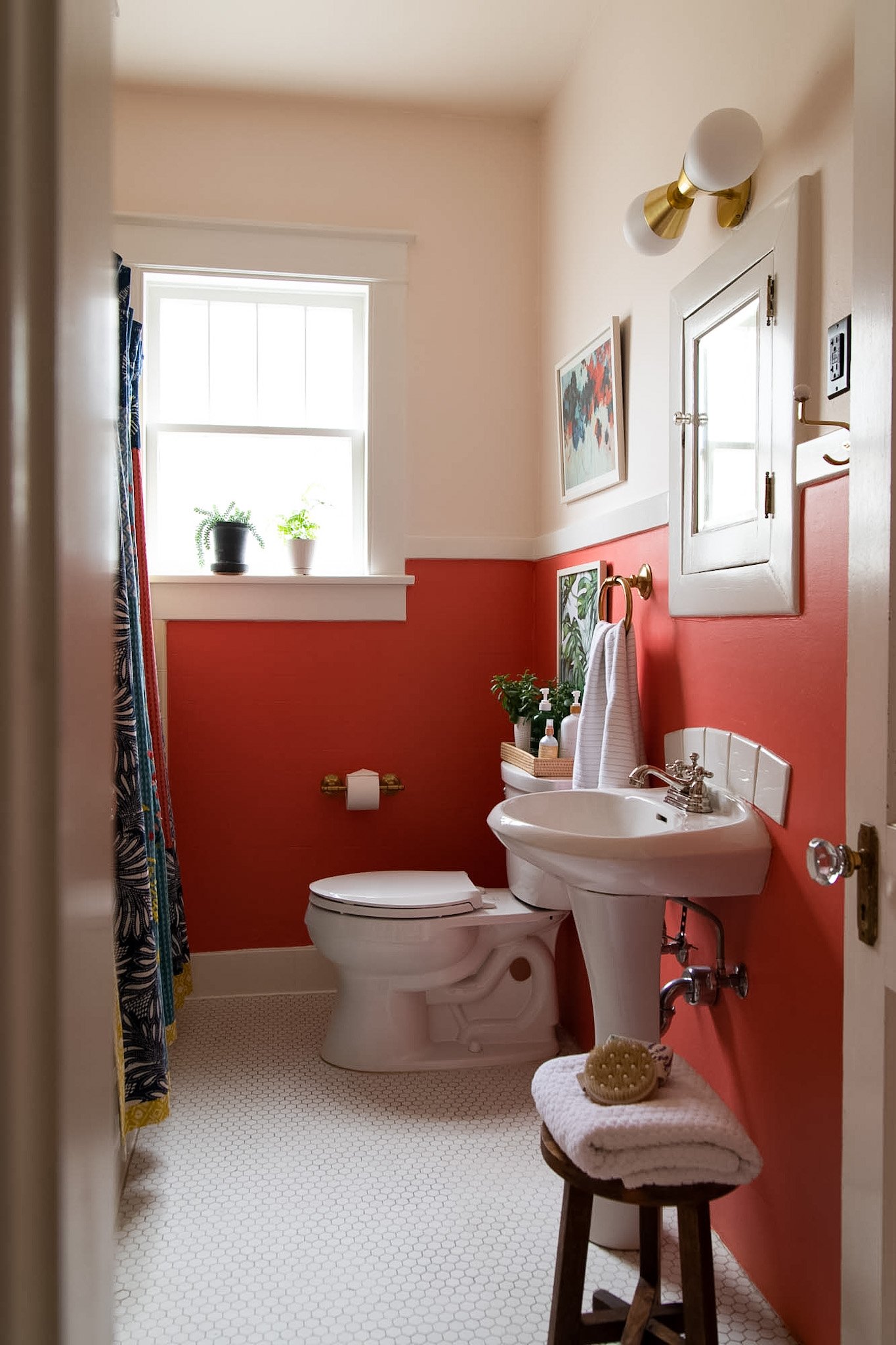
The parameters I had to work with were the retro, butter-yellow tile that’s in the shower and the well-worn white penny tile on the floor. Whatever paint I chose had to compliment those two elements.
There’s plenty of colors that go with yellow, but I was really leaning towards a bright pink/coral hue. So I ordered several paint samples from Samplize. Being able to view a paint-swatch that’s large enough to get a true reading is super important when choosing a paint color!
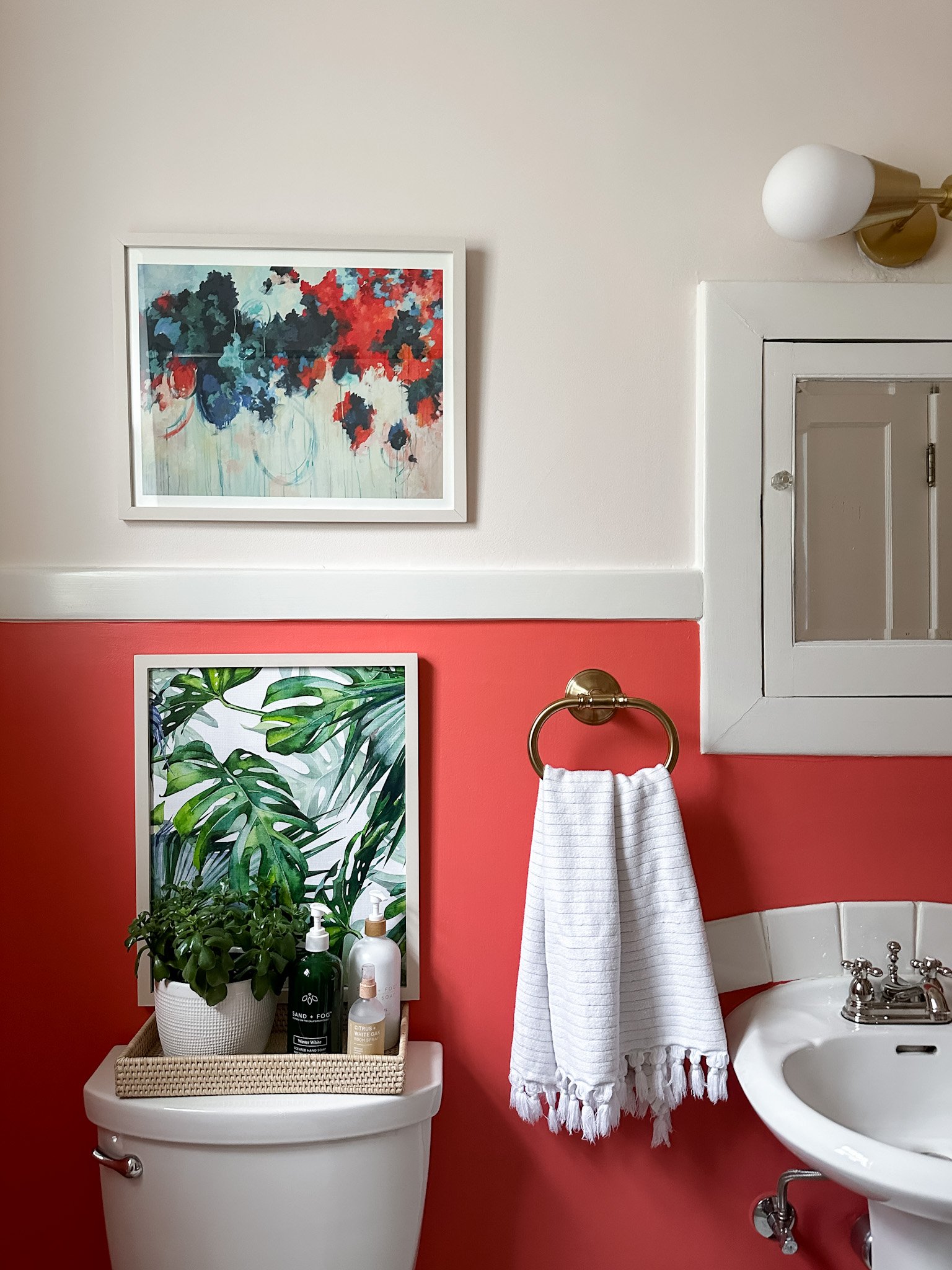
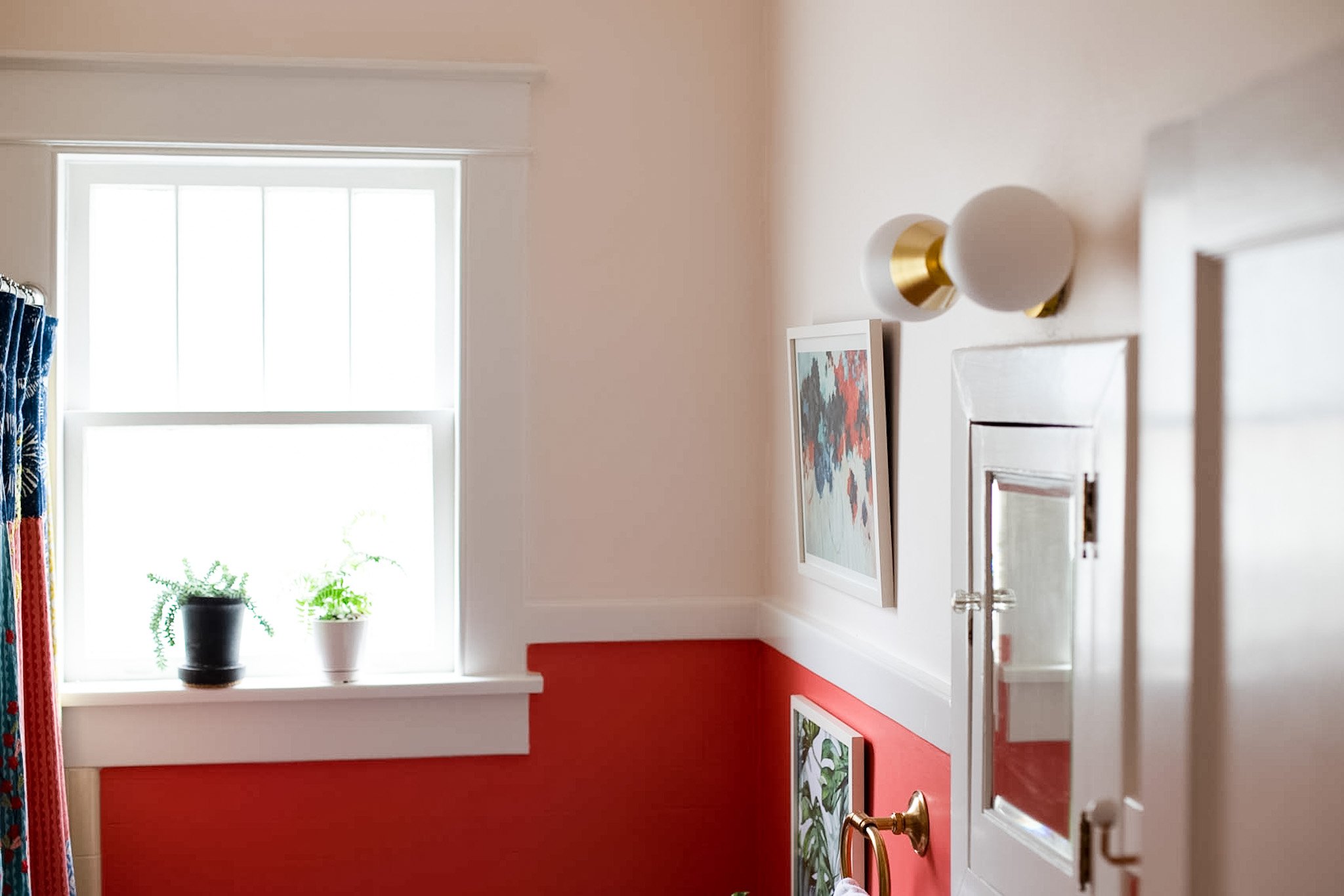
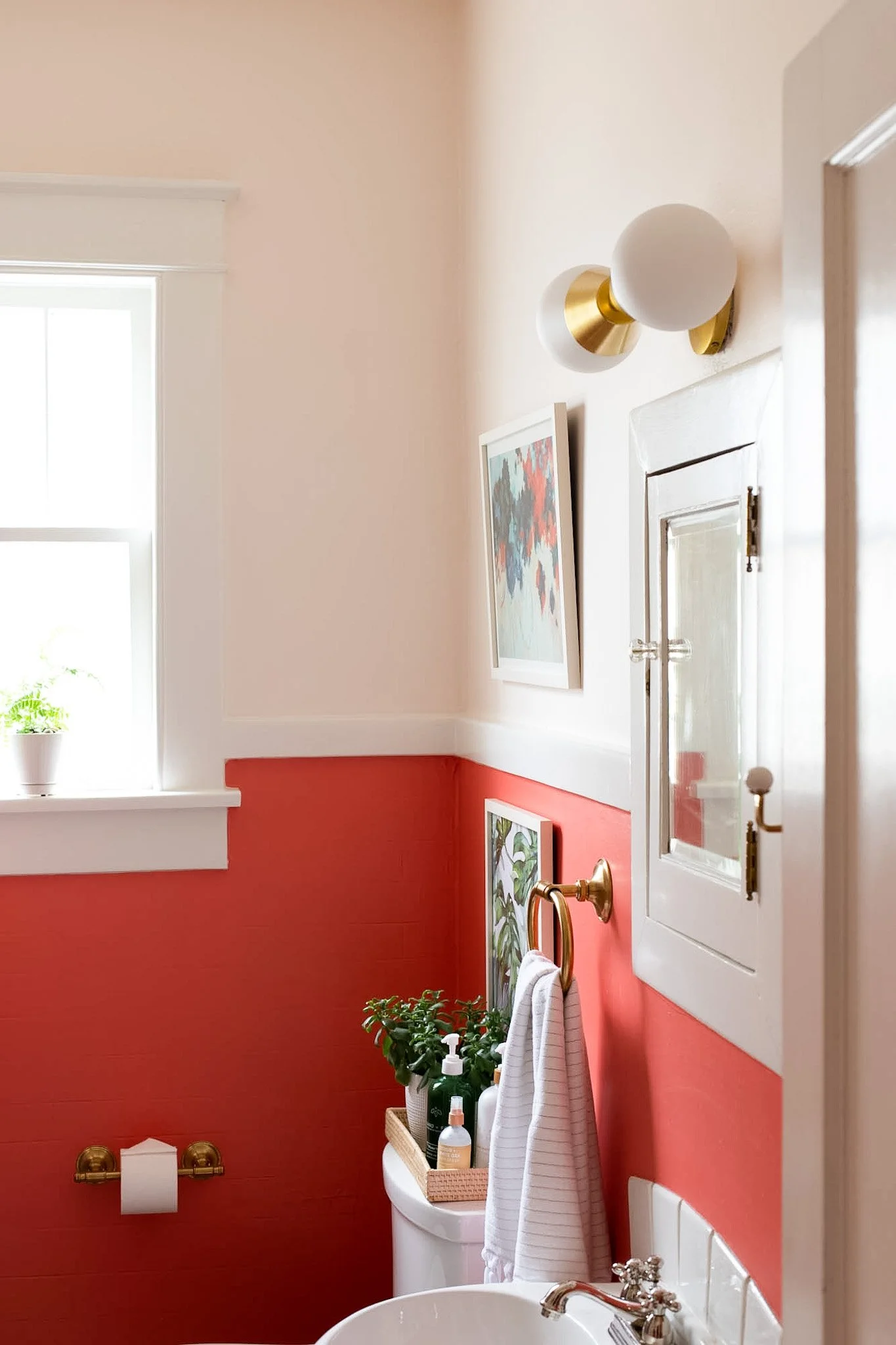
For my bathroom I wanted to go with 2 colors—a darker hue on the bottom below the chair rail trim and a lighter version of that same color family on the upper wall and ceiling.
Here she is during the process of trying to land on the perfect paint colors.


I chose Winter Sky, 2163-70 for the upper wall and ceiling. It’s a creamy white with a soft pink undertone.

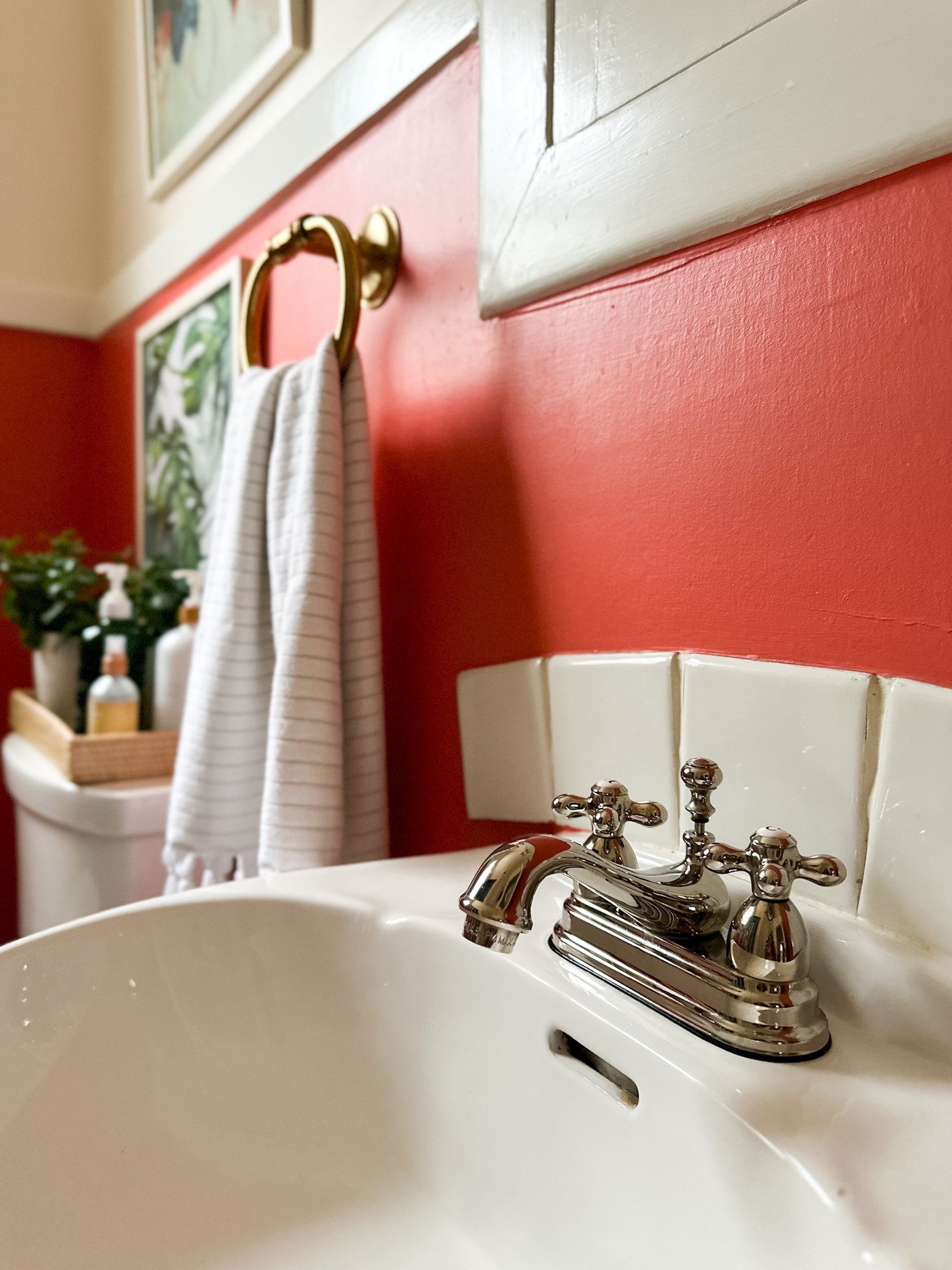
Bird of Paradise, 1305 was the clear winner for the bottom half of the wall. It’s coral color gives off serious tropical energy!

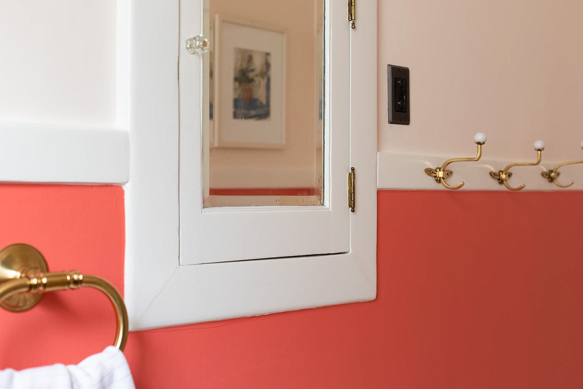
For the trim and doors we used White Dove, OC-17—a white paint I return to time and time again.
The “After” Shot

I’m thrilled with how the colors turned out. The boldness of the Bird of Paradise on the lower wall, combined with the softness of the Winter Sky hue on the upper wall is hitting just right in all the ways.
I really love how the Winter Sky on the upper wall and the ceiling creates such a nice soft atmosphere in the room. If we had chosen the traditional way of painting the ceiling white it would have made the room seem choppy. Instead there’s a seamless feeling in the space. You can see a bit of that detail in a couple of the pictures below.
Installing New Hardware and Fixtures
We installed new brushed brass hardware and a new brass light fixture. I wanted to bring in the brass touch because it ties in with the original crystal and brass door knobs in our home.
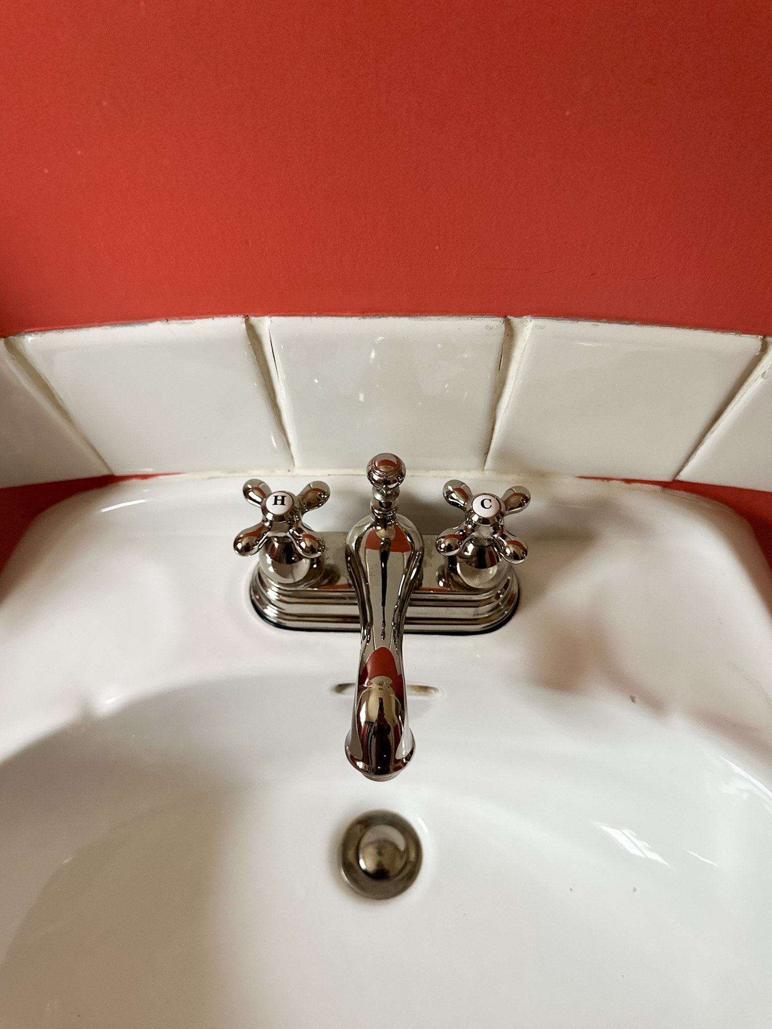
We also installed a new polished nickel faucet. I like the mix of metals in the room. It keeps it from being too over-the-top into the brass category. Plus the warm tones of the polished nickel looks great alongside the brass fixtures.
Zhushing it Up With the Decor
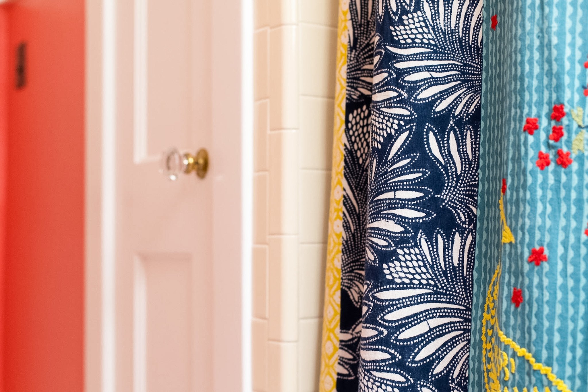
I also scored a shower curtain from Anthropologie (now out of stock) that pulls all the colors together perfectly! Plus, the pattern and color in the curtain bring in the same vibe that wallpaper would. And the curtain has enough personality to hang with the bold paint! Win-win!
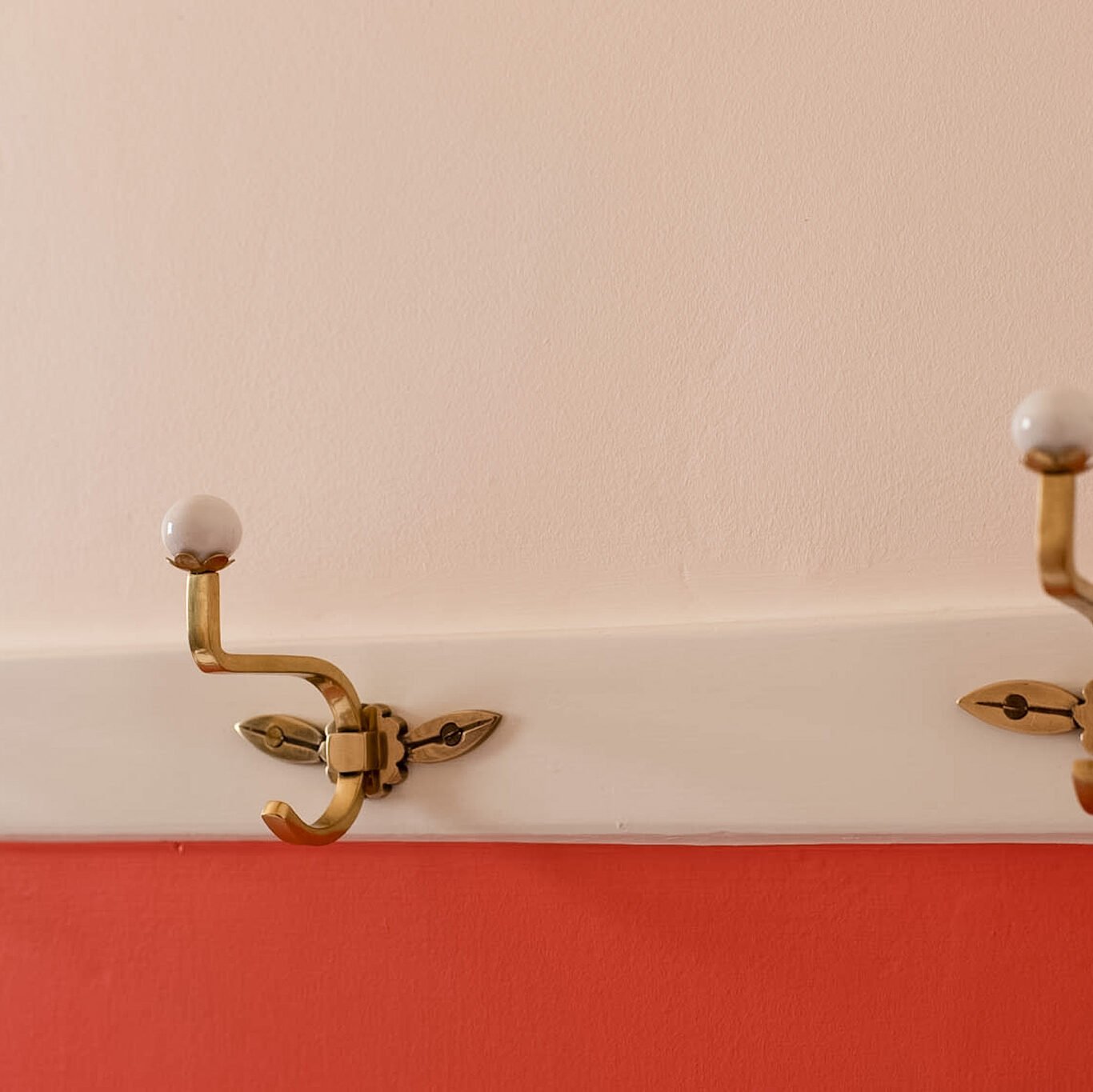
And I added these playful brass and ceramic towel hooks to the chair rail trim. They add just the amount of whimsy I was looking for. Isn’t it great when practicality and style come together so nicely?
So, what do you think about this warmer color trend that we’re seeing? Have you noticed it?
If you have a project coming up that you’d like some help with I’d love to chat with you about it! Feel free to check out my E-design services. You can read more about my process here.