
Easy Tips for Styling a Mantel—what to aim for!
Back in the days of my first experience with styling a mantel I was completely stumped as to how to achieve a visually pleasing vignette. Other people made it seem so simple and yet I really struggled. But like a lot of things in life with some trial and error—combined with a deep dive into reading and learning all that I could—really helped me get a better handle on what goes into the ingredients that create a lovely design.
When it comes to styling a mantle there are a few key things to keep in mind. HOWEVER, there’s no one way to style anything. It’s not an exact science. The main thing is to create something that you love! No matter what items you choose, aim for these 5 elements and you’ll set yourself up for success—
Five Elements to Aim for when Styling a Mantel
Layering is KEY
Use an Assortment of Textures
Strive for a Variety of Heights
Keep the Color Palette Tight
Balance, Balance, Balance
Let’s break it down a little more.

Layering is KEY
Starting with a mirror is an easy beginning. It gives the mantle an anchor and helps to bounce around the light in the room. PLUS, the reflection from the room adds a large dose of that layering effect you’re aiming for. This establishes a foundation on which we’ll continue to build out.
As you continue styling your mantel bring in smaller pieces of art to continue that layering effect.
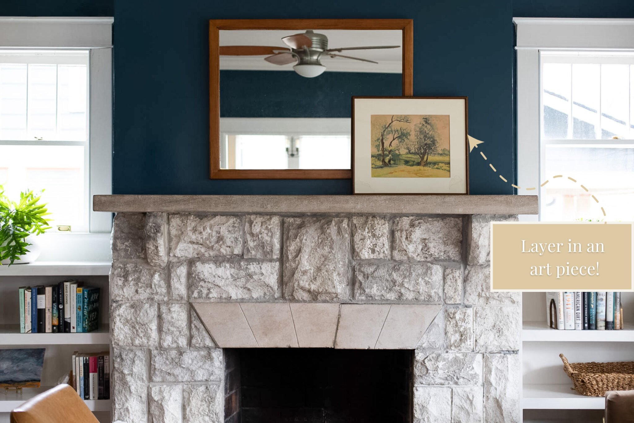
Continue to layer with pieces that bring balance to the mantel. You can almost think of it like a pyramid you’re building with the mantle being the base, the mirror being the apex, and the art being the sides.
Resist the tendency to push styling pieces apart. Instead, pull the pieces into the front of the mirror to create more of a layered look.
Notice how the mirror also reflects the shapes adding even more layering effect. Plus as we continue to layer shadows will form creating even more depth and visual intrigue.
As you continue styling your mantel bring in smaller pieces of art to continue that layering effect.
Continue to layer with pieces that bring balance to the mantel. You can almost think of it like a pyramid you’re building with the mantle being the base, the mirror being the apex, and the art being the sides.
Resist the tendency to push styling pieces apart. Instead, pull the pieces into the front of the mirror to create more of a layered look.
Notice how the mirror also reflects the shapes adding even more layering effect. Plus as we continue to layer shadows will form creating even more depth and visual intrigue.
Use an Assortment of Textures

Texture isn’t only felt with our sense of touch, its also experienced with our sight. It comes in a variety of ways. Texture shows up in hard and soft finishes. It shows up in the surface of objects. They might be polished and glossy, or rough and woven. The texture might be reflective or matte, porous or smooth.
For instance the metal and glass candlesticks on my mantel have a shiny quality about them. Whereas the wooden ones bring in a warm texture with their woodgrain showing through. The candles themselves add in another textural element with their waxy bulk.
Keep in mind that shapes also bring in an element of visual texture. The round pillar candles, the rectangle art frames, the slim tapers of the candlesticks all bring in textural quality.
If you’ve been around the blog awhile you know I’m a big fan of texture. Whatever styling pieces you choose, aim for a mixture of textural differences.
Vary the Visual Heights
Just like the view of a gorgeous mountain range, one of the things that makes a city skyline so interesting is the multiplicity of heights. The abundance of height variations gives the eye plenty to explore and take in! Armed with that idea when styling a mantel will help so much.
This really tripped me up the most back in the day when I was first attempting to style a fireplace mantel. But I daresay creating a variety of heights—alongside balance, which we’ll get to in a hot second—may be at the top of the important tricks.

Keep a Tight Color Palette
A tight color palette will help make the vignette feel cohesive. In the case of my mantel you can see the sepia tones in the art pieces and the wooden candlesticks. The pillar candles and the art mat, as well as the checkered boxes bring in an ivory hue. The green of the fern is repeated in the larger art piece. And the warm wood tone of the mirror frame reoccurs in the terracotta planter.
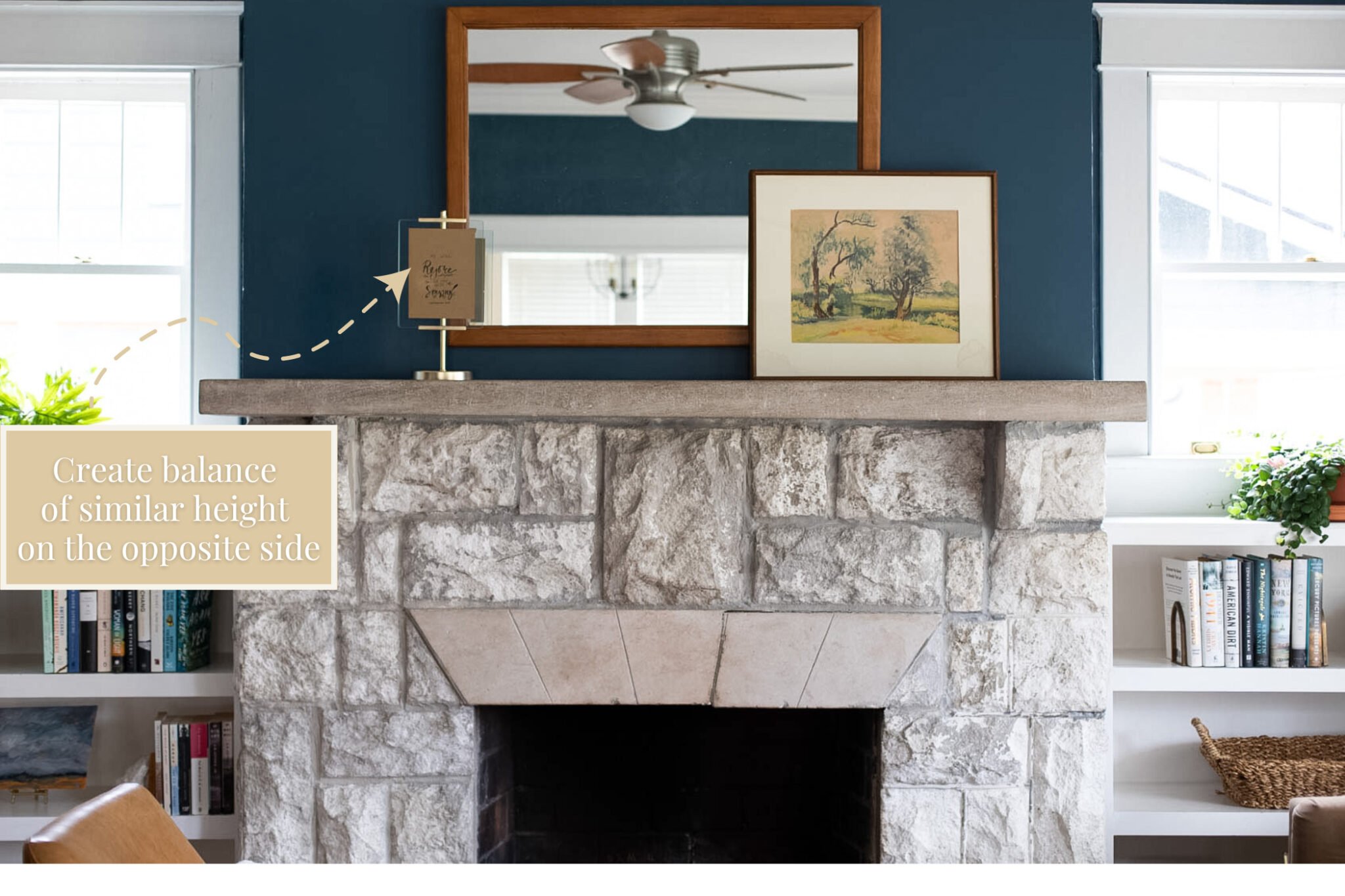
Balance, Balance, Balance
Some folks love symmetry while others appreciate a more asymmetrical style. Either look is lovely in its own way, but the key is balance. Strive to create a similar visual weight to each side of the mantel.

My mantel has bit of an asymmetrical style with the bulkier pieces— the planter and boxes—on one side of the mantel. But the varying heights of the taper and pillar candles combined with the art framed in a freestanding brass stand creates the weighted balance on the one side to offset the boxier and weightier elements on the opposite side.
So there you have it, my five tips for styling a mantel you love! Don’t be afraid to PLAY AROUND with your styling. Sometimes it takes a little time and tweaking to get it just the way you want.
And if you find yourself overwhelmed with a styling project you want to work on, reach out. I’m always happy to be a resource!